per la creazione di grafici e la visualizzazione dei dati
Grazie a un’interfaccia pluripremiata e a un’intuitiva tecnologia guidata che guida gli utenti passo dopo passo nel processo di creazione dei grafici e di analisi dei dati, SigmaPlot offre la flessibilità necessaria per creare grafici e analisi statistiche convincenti che non si possono ottenere con un semplice foglio di calcolo.
Adalta è Rivenditore Unico per l’Italia di Grafiti SigmaPlot. Richiesta quotazione…
A cosa serve SigmaPlot
SigmaPlot aiuta a creare rapidamente grafici accurati
Con la nuova interfaccia grafica delle proprietà è possibile selezionare la categoria di proprietà nell’albero a sinistra e quindi modificare le proprietà a destra. La modifica viene immediatamente graficata e se si sposta il cursore dal pannello, questo diventa trasparente e si può vedere l’effetto delle modifiche senza uscire dal pannello.
La procedura “seleziona a sinistra e cambia a destra” rende la modifica dei grafici facile e veloce. SigmaPlot vi porta oltre i semplici fogli di calcolo per aiutarvi a mostrare il vostro lavoro in modo chiaro e preciso. Con SigmaPlot potete produrre grafici di alta qualità senza passare ore davanti al computer. SigmaPlot offre una perfetta integrazione con Microsoft Office®, per cui è possibile accedere facilmente ai dati dei fogli di calcolo di Microsoft Excel® e presentare i risultati in presentazioni di Microsoft PowerPoint®.

L’interfaccia utente include anche controlli a nastro in stile Microsoft Office. L’interfaccia della finestra a schede organizza in modo efficiente i fogli di lavoro e i grafici per facilitarne la selezione. Le schede possono essere organizzate in gruppi di schede verticali o orizzontali. I riquadri di Graph Gallery e Notebook Manger possono essere spostati in qualsiasi posizione e posizionati facilmente grazie alle guide del pannello di aggancio. È possibile aggiungere oggetti di uso frequente alla “Quick Access Toolbar”. Ad esempio, si possono aggiungere le opzioni Salva blocco note, Chiudi tutto, Aggiorna pagina grafica e Modifica tracciato.
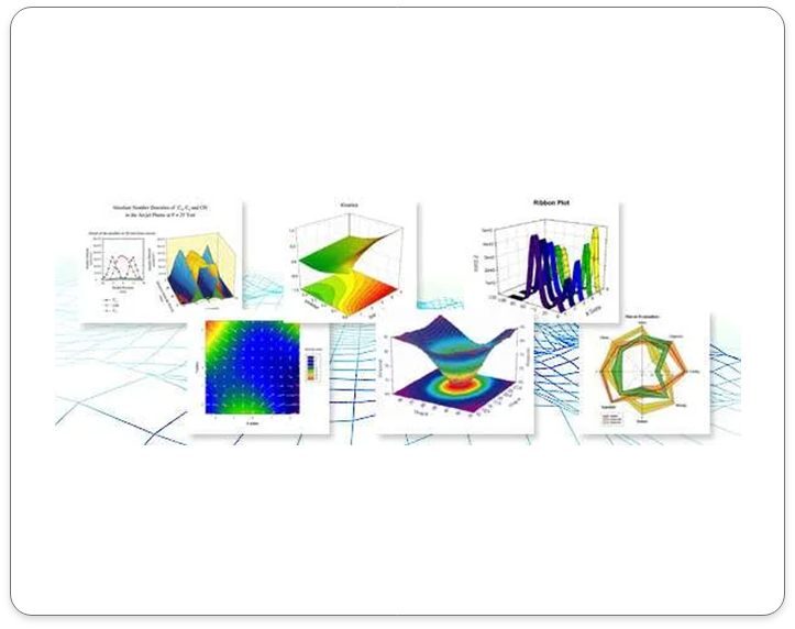
Più di 100 tipi di grafici tecnici 2D e 3D
Dai semplici grafici di dispersione 2D agli avvincenti grafici a contorno e ai nuovi grafici radar e a densità di punti, SigmaPlot vi offre l’esatto tipo di grafico tecnico di cui avete bisogno per le vostre ricerche più impegnative. Inoltre, per aiutarvi a vedere le interazioni tra i vostri dati in 3D, SigmaPlot è in grado di renderizzare più maglie tridimensionali intersecanti con la rimozione delle linee nascoste. Con così tanti tipi di grafici e diagrammi tra cui scegliere, potrete sempre trovare la migliore rappresentazione visiva dei vostri dati.


Utilizzate il Global Curve Fitting per analizzare simultaneamente più dati.
il Global Curve Fitting viene utilizzato quando si desidera adattare un’equazione a più serie di dati contemporaneamente. L’equazione selezionata deve avere esattamente una variabile indipendente. I set di dati possono essere selezionati da un foglio di lavoro o da un grafico, utilizzando una varietà di formati di dati. È inoltre possibile specificare il comportamento di ciascun parametro dell’equazione rispetto ai set di dati. Un parametro può essere localizzato per avere un valore separato per ogni set di dati, oppure può essere condiviso per avere lo stesso valore per tutti i set di dati.
La procedura guidata per il Global Curve Fitting è molto simile alle procedure guidate per la regressione e l’adattamento dinamico per quanto riguarda la struttura e il funzionamento. La differenza principale è il pannello aggiuntivo mostrato di seguito per specificare i parametri condivisi.
Ottenere dati da quasi tutte le fonti
SigmaPlot dispone di formati di importazione per tutti i più comuni file di testo. Tra questi, un importatore di file ASCII di uso generale che consente di importare file delimitati da virgole e delimitatori selezionati dall’utente. Inoltre, è possibile importare tutti i formati di Excel. I formati di input dei dati SPSS, Minitab, SYSTAT e SAS sono supportati da SigmaPlot.
È possibile importare file elettrofisiologici binari e di testo di Axon. Inoltre, il modulo Elettrofisiologia, acquistabile separatamente, consente di importare parti specifiche di file elettrofisiologici dai file ABF di Axon Instruments, dal formato Acquire di Bruxton Corporation e dal formato Pulse di HEKA electronik. Importazione di qualsiasi database compatibile con ODBC. Sono supportati i file di database Excel e Access. Esecuzione di query SQL sulle tabelle e importazione selettiva delle informazioni.
SigmaPlot Features
Choose from a wide range of graph types to best present your results
From simple 2-D scatter plots to compelling contour and the new radar and dot density plots, SigmaPlot gives you the exact technical graph type you need for your demanding research.
And, to help you see interactions in your 3-D data, SigmaPlot powerfully renders multiple intersecting 3-D meshes with hidden line removal. With so many different chart and graph types to choose from, you can always find the best visual representation of your data.
Statistical Analysis is no longer a daunting task
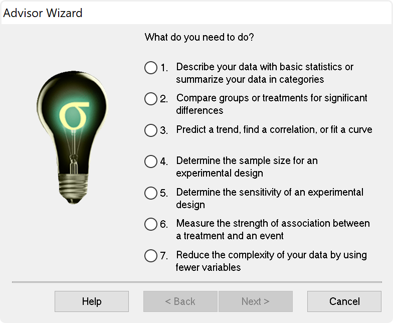
SigmaPlot now offers almost 50 of the most frequently used statistical tests in scientific research by integrating SigmaStat into one application. Suggestion of the most appropriate statistical tests is offered by a software-based Advisor. Raw and indexed data formats are accepted to avoid data reformatting.
Violation of data assumptions is checked in the background and, if true, the correct test to use is recommended. Reports with descriptive interpretations are generated and graphs specific to each test may be created.
SigmaPlot now employs an all new user interface allowing users to easily setup a global curve fit. This gives users the ability to easily share one or more equation parameters across multiple data sets.
Non-linear curve fitting is known to produce incorrect results in some instances.The problem is that you don´t necessarily know that this has happened. Dynamic Curve Fitting is designed to determine if this has happened and if so what the likely best fit is.
Export your graphs as high-resolution, dynamic Web pages – not simple GIF or JPEG files. Viewers can explore data used to create graphs and zoom, pan or print images at full resolution directly from a Web Browser. Automatically generate active Web objects from your graphs or embed the objects within other Web pages.
- Simply select the Web graph to share its data with colleagues and students
- Share the data behind your graphs with colleagues and students
- Enable colleagues to print your full report from your intranet or Web site directly from their browsers – without compromising the quality of the graphs
- Create an optional password while exporting your graph to limit data access to authorized users
- Produce Web documents without knowing HTML or embed SigmaPlot Web object graphs within HTML files to create interactive electronic reports
Each worksheet can hold a list of user defined transforms that will automatically be re-run whenever the transform input data has changed.
Let’s say you would like to start by selecting a particular kind of graph but you don’t know how to set up the worksheet to achieve it. SigmaPlot lets the user select a graph first and then gives you a pre-formatted worksheet to structure their data. The data entered into the worksheet is immediately displayed on the graph. This feature can demonstrate to you the strong relationship between the data format and the graph type.
Import
- Excel, ASCII Plain Text, Comma Delimited, MS Access
- General ASCII import filter
- SigmaPlot DOS 4.0, 4.1, 5.0 data worksheets, SigmaPlot 1.0, 2.0 Worksheet, and 3.0, 4.0, 5.0, 6.0, 7.0, 8.0, 9.0, 10.0 and 11.0 Windows, SigmaPlot 4.1 and 5.0 Macintosh data worksheets
- Comma delimited and general purpose ASCII import filter
- Symphony, Quattro Pro, dBASE E, DIF, Lotus 1-2-3, Paradox
- SigmaStat DOS and 1.0 worksheets, SYSTAT, SPSS, SAS data set V6. V8, V9, SAS export file, Minitab V8 to V12
- SigmaScan, SigmaScan Pro, SigmaScan Image, Mocha
- TableCurve 2D and 3D
- Axon Binary, Axon Text
- Import ODBC compliant databases
- Run SQL queries on tables and selectively import information
- Import Excel 2007 files directly into SigmaPlot
Export
- Excel, ASCII Plain Text, Comma Delimited, MS Access
- General ASCII import filter
- SigmaPlot DOS 4.0, 4.1, 5.0 data worksheets, SigmaPlot 1.0, 2.0 Worksheet, and 3.0, 4.0, 5.0, 6.0, 7.0, 8.0, 9.0, 10.0 and 11.0 Windows, SigmaPlot 4.1 and 5.0 Macintosh data worksheets
- Comma delimited and general purpose ASCII import filter
- Symphony, Quattro Pro, dBASE E, DIF, Lotus 1-2-3, Paradox
- SigmaStat DOS and 1.0 worksheets, SYSTAT, SPSS, SAS data set V6. V8, V9, SAS export file, Minitab V8 to V12
- SigmaScan, SigmaScan Pro, SigmaScan Image, Mocha
- TableCurve 2D and 3D
- Axon Binary, Axon Text
- Import ODBC compliant databases
- Run SQL queries on tables and selectively import information
- Import Excel 2007 files directly into SigmaPlot
Graphing software that makes data visualization easy
Graph creation starts with SigmaPlot’s award-winning interface. Take advantage of ribbon collections of common properties, tabbed selection of graphs, worksheets and reports, right mouse button support and graph preferences. Select the graph type you want to create from the Graph Toolbar’s easy-to-read icons. The interactive Graph Wizard leads you through every step of graph creation. You get compelling, publication-quality charts and graphs in no time. SigmaPlot offers more options for charting, modeling and graphing your technical data than any other graphics software package.
Compare and contrast trends in your data by creating multiple axes per graph, multiple graphs per page and multiple pages per worksheet. Accurately arrange multiple graphs on a page using built-in templates or your own page layouts with SigmaPlot’s WYSIWYG page layout and zoom features.
Customize every detail of your charts and graphs
SigmaPlot offers the flexibility to customize every detail of your graph. You can add axis breaks, standard or asymmetric error bars and symbols; change colors, fonts, line thickness and more. Double-click on any graph element to launch the Graph Properties dialog box. Modify your graph, chart or diagram further by pasting an equation, symbol, map, picture, illustration or other image into your presentation. And select anti-aliasing to display jaggy-free smooth lines that can be used in your PowerPoint® presentations.
Quickly Plot your Data from Existing Graph Templates in the Graph Style Gallery
Save all of the attributes of your favorite graph style in the Graph Style Gallery. Add greater speed and efficiency to your analysis by quickly recalling an existing graph type you need and applying its style to your current dataset.
- Quickly save any graph with all graph properties as a style and add a bitmap image to the gallery
- No need to be an expert, create customized graphs in no time with the Graph Gallery
- Choose an image from the Graph Style Gallery to quickly plot your data using an existing graph template
- Save time by using a predetermined style to create a graph of the data
- Avoid re-creating complex graphs
But, remember, you don’t necessarily need to use the power of the Graph Gallery since every graph in SigmaPlot is a template. In the Notebook Manager, you can copy and paste a graph from one worksheet to another and all the attributes of that graph are applied to the new data saving much time.
Publish your charts and graphs anywhere
Create stunning slides, display your graphs in reports or further customize your graphs in drawing packages. Save graphs for publication in a technical journal, article or paper with SigmaPlot’s wide range of graphic export options. Presenting and publishing your results has never been easier – or looked this good.
Create customized reports with SigmaPlot’s Report Editor or embed your graphs in any OLE (Object Linking and Embedding) container – word processors, Microsoft PowerPoint or another graphics program. Then, just double click your graph to edit directly inside your document. Quickly send your high-resolution graphs online to share with others.
Data Analysis Doesn’t Get Much Easier
SigmaPlot provides all the fundamental tools you need to analyze your data from basic statistics to advanced mathematical calculations. Click the View Column Statistics button to instantly generate summary statistics including 95% and 99% confidence intervals. Run t-tests, linear regressions, non-linear regressions and ANOVA with ease. You can fit a curve or plot a function and get a report of the results in seconds. Use built-in transforms to massage your data and create a unique chart, diagram or figure. With SigmaPlot – it’s all so simple!
Use SigmaPlot within Microsoft Excel
Access SigmaPlot right from your active Microsoft Excel worksheet. Tedious cut-and-paste data preparation steps are eliminated when you launch SigmaPlot’s Graph Wizard right from the Excel toolbar. Use Excel in-cell formulas, pivot tables, macros and date or time formats without worry. Keep your data and graphs in one convenient file.
Transforms and Quick Transforms
Generate simulated data or modify worksheet columns of data with transforms. Create simple one-line transforms with the Quick Transforms feature that walks you through transform implementation. Or create extremely complex transforms with hundreds of lines of code.
Use the Regression Wizard to fit data easily and accurately
Fitting your data is easy with the SigmaPlot Regression Wizard. The Regression Wizard automatically determines your initial parameters, writes a statistical report, saves your equation to your SigmaPlot Notebook, and adds your results to existing graphs or creates a new one!
The Regression Wizard accurately fits nearly any equation – piecewise continuous, multifunctional, weighted, Boolean functions and more – up to 10 variables and 25 parameters. You can even add your own curve fit equations and add them to the Regression Wizard.
Use the Dynamic Curve Fitter to determine if your fit is valid
The Dynamic Curve Fitter performs 200 or more curve fits using your equation and data starting from optimally different initial starting values. The results are ranked by goodness of fit so that you can check the top ranked results against the result you obtained from the Regression Wizard.
For many simple equations, which are fit to data sets with a sufficiently large number of data points, the Dynamic Curve Fitter finds the same result as the Regression Wizard. But the problem is that the user simply does not know whether the solution found by the Regression Wizard is the best possible or not. So there is always a concern that the correct solution has not been found. Dynamic fitting minimizes this concern. Its use is encouraged prior to publishing results particularly if a complicated equation is used.
Plot Nearly ANY Mathematical Function
Plotting user-defined and parameterized equations is only a mouseclick away with the Plot Equation feature. Just type the function or select one from the built-in library and specify the parameters and the range. It’s that simple! Create your own built-in functions and save them for future use. Plot functions on new or existing graphs or plot multiple functions simultaneously using different parameter values. Save plotted X and Y results to the worksheet.
Maximize your Productivity with SigmaPlot’s Automation
Automate Complex Repetitive Tasks
Create macros in no time with SigmaPlot’s easy-to-use macro language. Not a programmer? No problem. With SigmaPlot, you can record macros by point-and-click with the macro recorder. Use macros to acquire your data, execute powerful analytical methods, and create industry-specific or field-specific graphs. Use one of the thirty built-in macros as provided or use these macros as a base to quickly create your own macros.
Share the power of SigmaPlot with less-experienced users by using macros to tailor the SigmaPlot interface for your particular application. Create custom dialog boxes, menu choices and forms to help guide novice users through a session.
Call on SigmaPlot´s functionality from external sources that have Visual Basic embedded including Microsoft Word®, Microsoft Excel®, Microsoft PowerPoint® or custom software applications. Analyze and graph your data using SigmaPlot within those applications.
For example, you can run a Visual Basic script in Microsoft Word® or Excel® that calls on SigmaPlot to generate and embed your graph in the document. SigmaPlot´s OLE2 automation provides unlimited flexibility.
SigmaPlot Has Complete Advisory Statistical Analysis Features
SigmaPlot is now a complete graphing AND an advisory statistics suite. All of the advanced statistical analysis features found in the package known as SigmaStat have now been incorporated into SigmaPlot along with several new statistical features. SigmaPlot guides users through every step of the analysis and performs powerful statistical analysis without the user being a statistical expert.
In addition to the EC50 value already computed, the user can also compute other user-entered EC values such as EC40 and EC60 and compute them instantly. Two five-parameter logistic functions have also been added and the Dynamic Curve Fitting feature included to help solve difficult curve fitting problems.
In earlier versions of SigmaPlot, almost all objects in a 2D graph were selectable with just a mouse click. However, almost all objects in a 3D graph were not. SigmaPlot now adds mouse selectability of all 3D graph objects with the ability to customize all 3D objects.
New Worksheet Features Include
- Import Excel worksheet data into a SigmaPlot worksheet or Open an Excel worksheet as an Excel worksheet in SigmaPlot
- Mini toolbar for worksheet cell editing
- Zoom enabled worksheet
- Worksheet scrolling with mouse wheel
- Line widths may be placed in the worksheet for graph customization
- Formatted text (subscript, etc.) in worksheet cells
Create stunning slides, display your graphs in reports or further customize your graphs in drawing packages. Save graphs for publication in a technical journal, article or paper with SigmaPlot’s wide range of graphic export options. Presenting and publishing your results has never been easier – or looked this good. Create customized reports with SigmaPlot’s Report Editor or embed your graphs in any OLE container – word processors, Microsoft PowerPoint or graphics program. Just double click your graph to edit directly inside your document. Quickly send your high-resolution graphs online to share with others.
SigmaPlot’s Notebook Functionality
- Can hold SigmaPlot worksheets, Excel worksheets, reports, documents, regression wizard equations, graph pages, and macros.
- New dialog-bar-based notebook that has several states: docks, re-sizable, hide-able, summary information mode, etc.
- Browser-like notebook functionality that supports drag-n-drop capabilities
- Direct-editing of notebook summary information
Automate Routine and Complex Tasks
- Visual Basic compatible programming using built-in macro language interface
- Macro recorder to save and play-back operations
- Full automation object support – use Visual Basic to create your own SigmaPlot-based applications
- Run built-in macros or create and add your own scripts
- Add menu commands and create dialog boxes
- Toolbox ribbon: helpful macros appear as separate grouped items
- Export graph to PowerPoint Slide (macro)
- “Insert Graph to Microsoft Word” Toolbox ribbon macro
- Keyboard shortcuts in the Graph page and most Microsoft Excel keyboard shortcuts in the worksheet.
Symbol Types
- Over 100 symbol types
- 30 new symbol types that include half-filled and BMW styles
- Edit font when using text as symbol
- Access new symbols directly from graph properties dialog, toolbar, legend page and the symbol dialog box
- More line types such as dash and gap patterns
- More fill patterns for bar charts and area plots, that can be independently set from the line color
SigmaPlot Report Editor
- Cut and paste or use OLE to combine all the important aspects of your analysis into one document.
- Copy / Paste tabular data between report and Excel worksheet
- Choose from a wide range of styles, sizes and colors from any system font
- New tables with pre-defined styles or user customized
- Export to most word processors
- Add decimal tabs, tab leader, true date/time fields
- Vertical and horizontal rulers for report formatting
- Auto-numbering
- Change report background color
- Improved formatting ruler
- Zoom enabled in reports
- Drag and drop Word 2007 and 2010 documents into reports
Page Layout and Annotation Options
- OLE 2 container and server
- Automatic or manual legends
- True WYSIWYG
- Multi line text editor
- Multiple curves and plots on one graph
- Multiple axes on one graph
- Arrange graphs with built-in templates
- Multiple levels of zooming and custom zooming
- Scale graph to any size
- Resize graphic elements proportionally with resizing graph
- Alignment and position tools
- Draw lines, ellipses, boxes, arrows
- Layering options
- Over 16 million custom colors
- Inset graphs inside one another
- Selection of graph objects
- Right-click property editing
- New zoom, drag and pan controls
- Mouse wheel scrolling enabled
- Right-click property editing for 3D Graphs
- Color schemes
- Paste graphic objects from other
Novità e miglioramenti in SigmaPlot 16
SigmaPlot has new features to make your work easier
New Graph Type (Via a Macro)
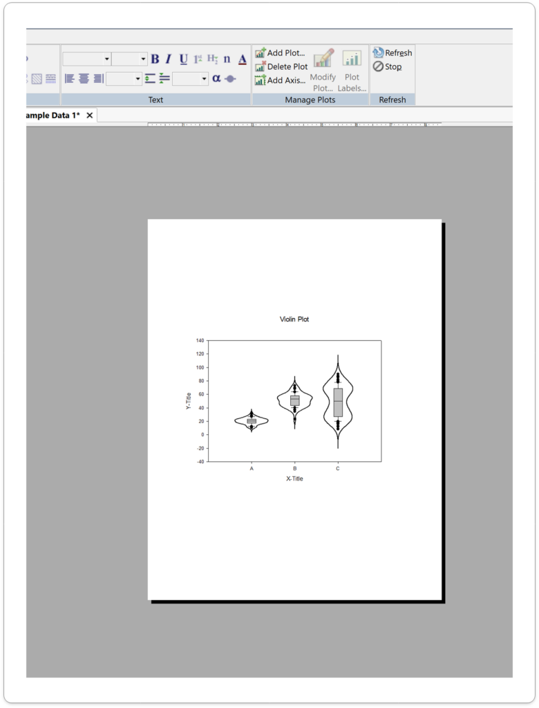
Violin Plot
Visualize Data Distributions with Clarity and Precision
SigmaPlot 16 brings you a powerful new macro for data visualization – Violin Plots. This innovative macro offers a more comprehensive and informative way to depict the distribution of numerical data for one or more groups.
What are Violin Plots
Violin Plot is used to visualize the distribution of numerical data of different variables. It depicts distributions of numeric data for one or more groups using density curves. The width of each curve corresponds with the approximate frequency of data points in each region.
Use the New Violin Plot Macro when you want to observe the distribution of numeric data, these are especially useful when you want to make a comparison of distributions between multiple groups. The peaks, valleys, and tails of each group’s density curve can be compared to visualize similarities and differences within groups.
This macro creates violin plots with multiple data columns showing the data density/concentration of each column or group.
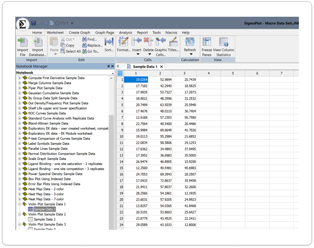
Input Data
Arrange Violin plot data using many columns. Topmost row is for column labels, and Left most column is for row labels. These labels appear on the Axis for the Violin plot. However, you can also create a Violin plot without any labels.
Data should contain only the numeric values, without missing or empty cells within the data in each column.
Output
Application areas for the new Violin Plots in SigmaPlot v16.
1. Biology and Medicine
- Gene expression analysis: Compare gene expression levels between different groups or conditions.
- Proteomics: Analyze protein abundance and distribution.
- Clinical research: Study the distribution of patient outcomes or biomarkers.
2. Environmental Science
- Species diversity: Compare species richness and abundance across different habitats.
- Climate change analysis: Examine changes in environmental variables over time.
- Pollution monitoring: Analyze pollutant concentrations and distributions.
- Survey data analysis: Explore the distribution of responses to survey questions.
- Economic research: Analyze income distribution, consumer behavior, or market trends.
- Social psychology: Study attitudes, beliefs, and behaviors within different populations.
4. Engineering and Technology:
- Manufacturing process analysis: Evaluate the distribution of product quality metrics.
- Materials science: Analyze the properties of materials and their variations.
- Performance testing: Compare the performance of different systems or components.
5. Other Applications:
- Finance: Analyze stock price distributions, risk assessment, or portfolio performance.
- Psychology: Study psychological traits, cognitive abilities, or personality differences.
- Education: Analyze student performance, learning outcomes, or teaching effectiveness.
This combined approach offers a richer understanding of your data compared to box plots alone.
Key Benefits of Violin Plots in SigmaPlot 16:
- Enhanced Data Understanding: Gain deeper insights into your data’s distribution and identify patterns or outliers.
- Improved Visualization: Create visually appealing and informative plots that effectively communicate your findings.
- Easy Customization: Customize the appearance of your violin plots to match your specific needs and preferences.
- Integration with Other Plot Types: Combine violin plots with other plot types, such as scatter plots or bar charts, for more comprehensive analysis.
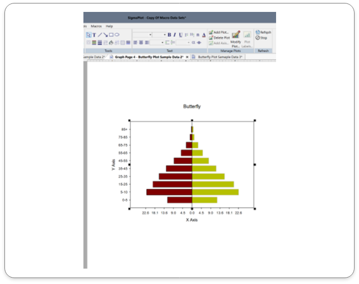
Butterfly Plots:
Unlock the Potential of Your Data with Butterfly Plots
With SigmaPlot 16’s Butterfly Plots, you can take your data analysis to the next level. Download a free trial today and experience the power of this innovative visualization tool.
New Graph Type (Via a Macro)
Unleash the Power of Data Visualization with Butterfly Plots
SigmaPlot 16 brings you a powerful new macro for data visualization – Butterfly Plots. This innovative macro offers a compelling way to visually compare two datasets side-by-side, revealing insights that might otherwise be hidden.
What are Butterfly Plots?
Butterfly plot is a type of bar chart that utilizes a unique visual style to highlight differences between two datasets. By comparing the lengths of the bars and their associated error bars, you can easily identify significant variations.
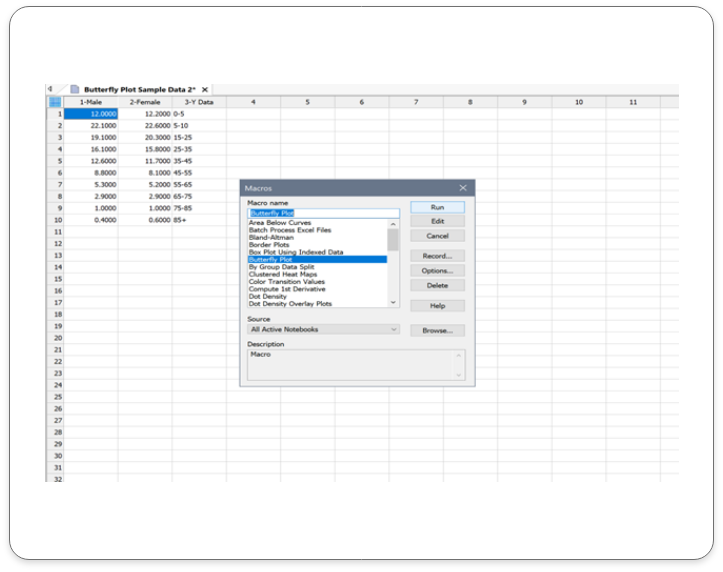
This Macro draws butterfly plots using the two different groups, events or categories of the data worksheet.

Input Data:
Column Title – To change the column title, select the worksheet column, right click and select the option column titles. The pop-up box will enable you to change the column title. This can also be done by double clicking on the selected column title cell. Leave the display value clear if you are not using column title.
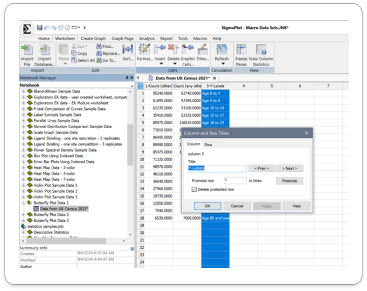
Row Title – To change the row title, select the worksheet column, right click and select the option column titles. The pop-up box will give you the option to change the row title. This can also be done by double clicking on the selected row title cell and inputting the details directly on the worksheet. Leave the display value clear if you are not using row title.
Run the Macro – After running the macro, the pop-up menu enables you to assign data to Group one and Group two.
Enter the Butterfly data in adjoining columns.
Click on the ‘OK’ button to run the macro
Output
The corresponding Butterfly Plot is as shown below:
Application areas for the new Butterfly Plots in SigmaPlot v16.
1. Healthcare and Medicine:
- Clinical trial data: Compare treatment outcomes between different groups.
- Patient demographics: Analyze differences in patient characteristics between treatment groups.
- Disease progression: Track changes in disease markers over time.
2. Environmental Science:
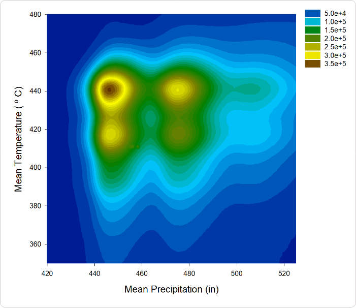
- Climate change analysis:Compare temperature and precipitation data over time.
- Pollution monitoring: Analyze pollutant levels in different locations.
- Biodiversity studies: Compare species diversity in different ecosystems.
- Social surveys: Compare responses to survey questions between different groups.
- Election analysis: Visualize voting patterns and trends.
- Public opinion polling: Analyze public opinion on various issues.
4. Business and Marketing:
- Sales performance: Compare sales figures for different products or regions.
- Market share analysis: Visualize market share trends over time.
- Customer satisfaction: Compare customer satisfaction ratings for different products or services.
5. Financial Analysis:
- Comparing stock performance: Visualize the performance of two stocks over a specific period.
- Analyzing financial ratios: Compare financial ratios for different companies or time periods.
- Tracking economic indicators: Monitor changes in economic indicators like GDP, inflation, and unemployment rates.
By effectively visualizing data, butterfly plots can help you identify trends, make informed decisions, and communicate insights clearly
Key Benefits of Butterfly Plots in SigmaPlot v16:
- Simple and Intuitive: Butterfly plots are easy to understand and interpret, even for those without extensive statistical knowledge.
- Effective Comparisons: Quickly compare the distributions of two or more datasets to identify trends, outliers, and significant differences.
- Customizable Visualizations: Tailor your butterfly plots to match your specific needs and preferences, including color schemes, labels, and annotations.
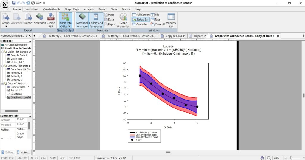
Confidence and Prediction Bands:
Unleash the Power of Data Analysis using Confidence and Prediction Bands with SigmaPlot 16:
What are Confidence and Prediction Bands?
Confidence and Prediction bands are used to evaluate the rightness of fit in regression and to predict future data points.
This feature in SigmaPlot facilitates users to create confidence and prediction bands for regression. Earlier versions of the product supported Confidence and Prediction lines, however, now users can create bands for the same.
Input Data
Click on the help tab and choose the non-linear regression tab. Double- click on the weighted regression work sheet to open the sample data set that will be used for the regression analysis.
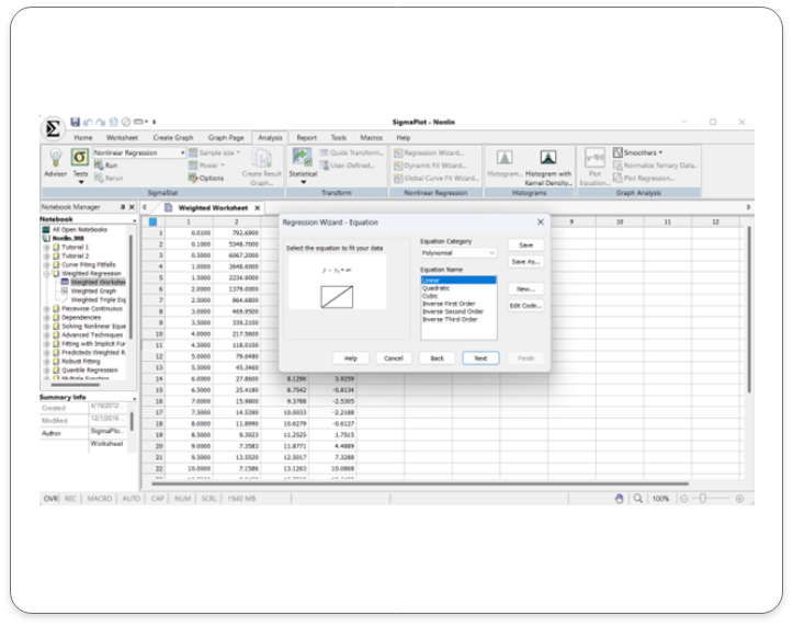
Select the analysis tab and click on the regression wizard. Select the regression type. Click next on the regression wizard after choosing the regression type ( Linear regression selected in this example).
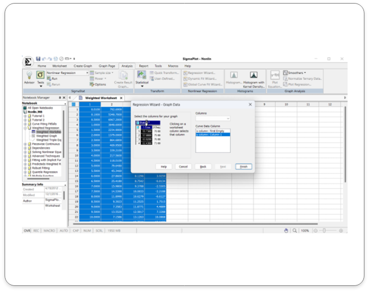
Click on your worksheet and select the columns for your graph and then click finish.
Output:
Confidence and Prediction bands are created along with the line.
Application areas for the new Confidence & Prediction Bands in SigmaPlot v16.
1. Scientific Research
Biology and Medicine:
- Modeling disease progression
- Analyzing clinical trial data
- Predicting drug efficacy and safety
Chemistry:
- Calibrating instruments and measurements
- Modeling chemical reactions
Physics:
- Analyzing experimental data
- Predicting physical phenomena
2. Engineering
- Structural Engineering: Assessing the reliability and safety of structures
- Mechanical Engineering: Optimizing designs and predicting performance
- Electrical Engineering: Analyzing circuit behavior and predicting system performance
3. Economics and Finance
- Financial Modeling: Forecasting stock prices, interest rates, and economic indicators
- Risk Assessment: Quantifying uncertainty in financial models
- Economic Forecasting: Predicting economic growth and inflation rates
- Psychology: Modeling human behavior and cognition
- Sociology: Analyzing social trends and patterns
- Political Science: Predicting election outcomes and public opinion
By using confidence and prediction bands, researchers and analysts can make more informed decisions and communicate their findings with greater confidence.
Key Benefits of Confidence & Prediction Bands in SigmaPlot v16:
- Enhanced Data Interpretation: Visualize uncertainty and identify regions of higher/lower confidence.
- Improved Decision-Making: Quantify risk and make informed decisions.
- Better Model Evaluation: Assess model fit and identify outliers/anomalies.
- Effective Communication: Clearly communicate uncertainty and variability in results.
Error Bars:
Visualize Uncertainty with Precision: Introducing Error Bars in SigmaPlot v16
What are Error Bands?
Error bars are a crucial tool in data visualization, providing valuable insights into the reliability and variability of data. They can represent confidence intervals, standard errors, standard deviations, or other relevant quantities. By visualizing uncertainty, error bars help prevent misinterpretation of data, avoid overestimating precision, and highlight significant differences between groups.
Input Data
In SigmaPlot v16, Error band support has been provided for the below mentioned graph styles in each of the graph types:
- Scatter Plot
- Line and Scatter Plot
Simple Scatter Error Bars:
A graphical representation of the variability of data used on graphs to indicate the error, or uncertainty in a reported measurement.
In SigmaPlot there is sample data available to understand error bars in scatter plots and Fitted curves.
Image: Has Scatter Plot with Error plot Data and the corresponding Graph
Double click on the graph icon for scatter plot with Error Bars and Fitted curves and the below graph is created for the above data.
Output:
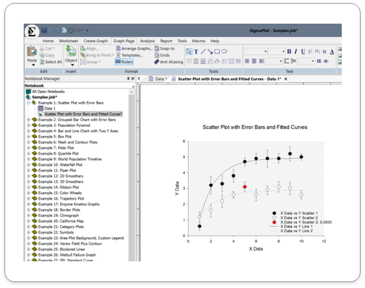
This line and scatter plot with error bars includes:
Application Areas for Error Bars in SigmaPlot v16:
Error bars are a versatile tool that can be applied to various scientific and engineering fields. Here are some common applications of error bars in SigmaPlot:
Scientific Research:
- Biology and Medicine: Compare treatment effects, analyze biological measurements, assess experimental precision.
- Chemistry: Quantify uncertainty, compare analytical methods, evaluate reproducibility.
- Physics: Analyze experimental data, estimate measurement error.
Engineering:
- Mechanical Engineering: Assess manufacturing variability, evaluate component reliability.
- Electrical Engineering: Analyze circuit performance, estimate measurement error.
Other Fields:
- Environmental Science: Monitor environmental variables and assess variability.
- Social Sciences: Analyze survey data and experimental results.
- Economics: Model economic trends and forecast outcomes.
Key Benefits of using the new Error Bands in SigmaPlot v16:
Enhanced Data Interpretation: Visualize uncertainty and variability in data.
Improved Decision Making: Make informed decisions based on reliable data. 3.
Effective Communication: Clearly communicate data and its limitations to others
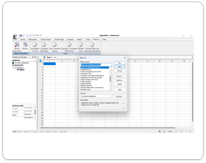
Macro to Import Multiple Excel Sheets
Streamline Your Workflow using the new Macro to Import Multiple Excel Sheets
What is the Excel Multi-sheet Import Macro
This feature facilitates the user to import multiple sheets with defined ranges from an Excel file. The user can import multiple sheets with different ranges. Additional statements need to be added for every sheet along with the import statement. This would remain the same as it facilitates backward compatibility (Considering that all previous versions can import only the first sheet (Which remains same to support backward compatibility, which imports only the first sheet in an excel file).
Input Data
Steps to import multiple sheets from an Excel workbook:
Open a new worksheet or any existing worksheet where the data must be imported from.
Open the Macros dialog and double click on the Macro tab. The pop-up box that comes up opens a list of options choose “Excel File Multi sheet Import” and press Edit.
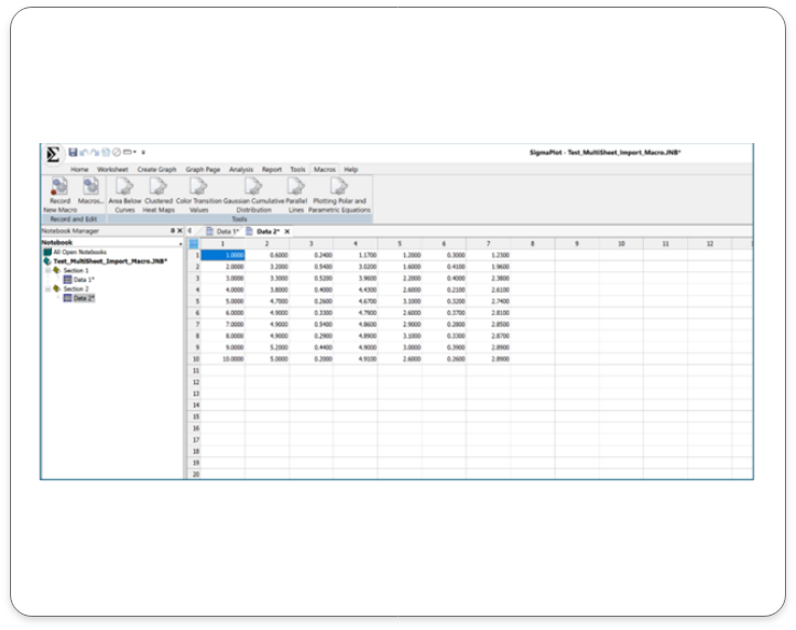
Output
In this sample two worksheet with defined rows and columns of data has been imported. Clearly marked as Data 1 and Data 2.
Key Application Areas for use of the Macro to Import Multiple Excel Sheets in SigmaPlot v16:
Clinical Research: Import large datasets from multiple clinical trials.
Biomedical Research: Analyze data from various experiments and studies
Environmental Science: Import data from multiple monitoring stations or field studies.
Finance: Import data from multiple financial reports or databases.
Social Sciences: Import data from surveys, polls, or census data.
Engineering and Manufacturing: Import data from multiple testing or production runs.
Key benefits to using the Macro to Import Multiple Excel Sheets in SigmaPlot v16:
Time Efficiency: Automate the import process and save time.
Reduced Errors: Minimize errors associated with manual data entry
Increased Productivity: Focus on data analysis and interpretation, rather than data entry.
Enhanced Data Integrity: Ensure data consistency and accuracy
Improved Workflow: Streamline your data analysis workflow
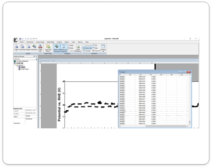
SigmaPlot v16 Now supports Large Data:
Empowering Data Analysis for Large Datasets
Conquer Data Challenges of Large Data with SigmaPlot 16:
SigmaPlot 16 is designed to handle large datasets with ease. By enhancing its architecture, SigmaPlot 16 empowers you to analyze complex data sets without compromising performance or accuracy.
Input Data
Here is an example of a Large Data Set in SigmaPlot v16:
Output Data
Here are some sample graph outputs using large data sets.
Key Application Areas of SigmaPlot 16 for Large Data:
Genomics and Bioinformatics: Analyze large-scale genomic and proteomic data.
Clinical Trials: Process and analyze vast amounts of clinical trial data
Environmental Science: Handle large datasets from environmental monitoring studies.
Financial Analysis: Analyze large financial datasets to identify trends and patterns.
Social Sciences: Analyze large-scale survey data and population studies.
Key Benefits of SigmaPlot 16 for Large Data:
- Efficient Data Handling: Seamlessly process and analyze large datasets.
- Improved Performance: Experience faster processing times and smoother workflows.
- Enhanced Visualization: Create clear and informative visualizations, even with complex data.
- Reliable Results: Trust in the accuracy and precision of your analyses.
Real-World Applications:
- Genomics and Bioinformatics: Analyze large-scale genomic and proteomic data.
- Clinical Trials: Process and analyze vast amounts of clinical trial data.
- Environmental Science: Handle large datasets from environmental monitoring studies.
- Financial Analysis: Analyze large financial datasets to identify trends and patterns.
Requisiti di sistema di SigmaPlot
Hardware
- 2 GHz 32-bit (x86) or 64-bit (x64) Processor
- 2 GB of System Memory for 32-bit (x86)
- 4 GB of System Memory for 64-bit (x64)
- 300 MB of Available Hard Disk Space
- CD-ROM Drive or Internet Connection
- 800×600 SVGA/256 Color Display or better
- Internet Explorer Version 8 or better
Software
- Windows XP, Windows Vista, Windows 7, Windows 8.x, Windows 10; Internet Explorer 6 or higher
- Office 2003 or higher (paste to Powerpoint Slide, Insert Graphs into Word and other macros)